Brand Upgrade

Our Challenge:
The client, a growing industrial consulting company in Colombia and other international markets, approached us to review the support and flexibility of its brand for entering new markets. To meet this request, we conducted a visual, phonetic, and identity study of its product lines and communication. The study revealed that the brand and its potential could be evolved into a simpler concept with the option of being recognized and pronounced correctly in the countries where the brand was to be introduced.

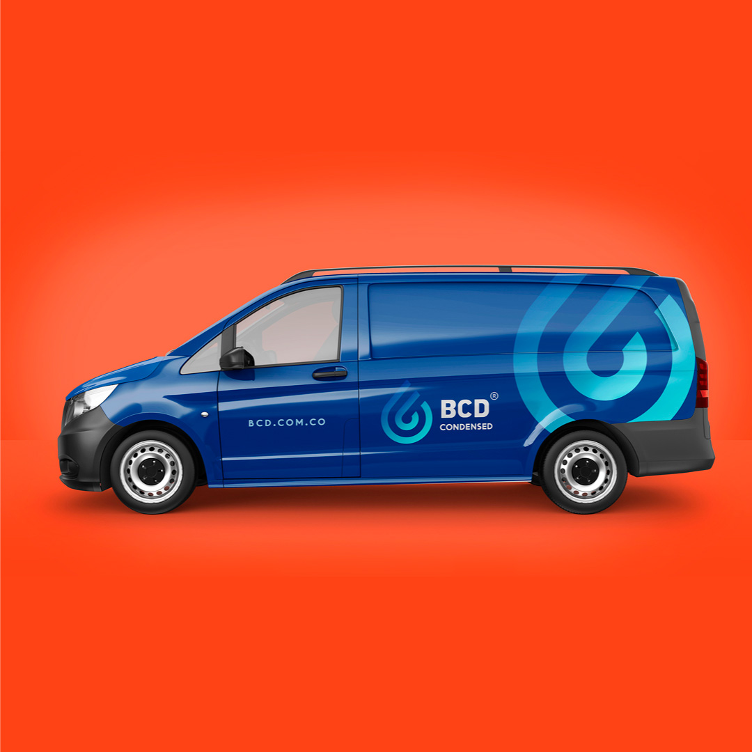
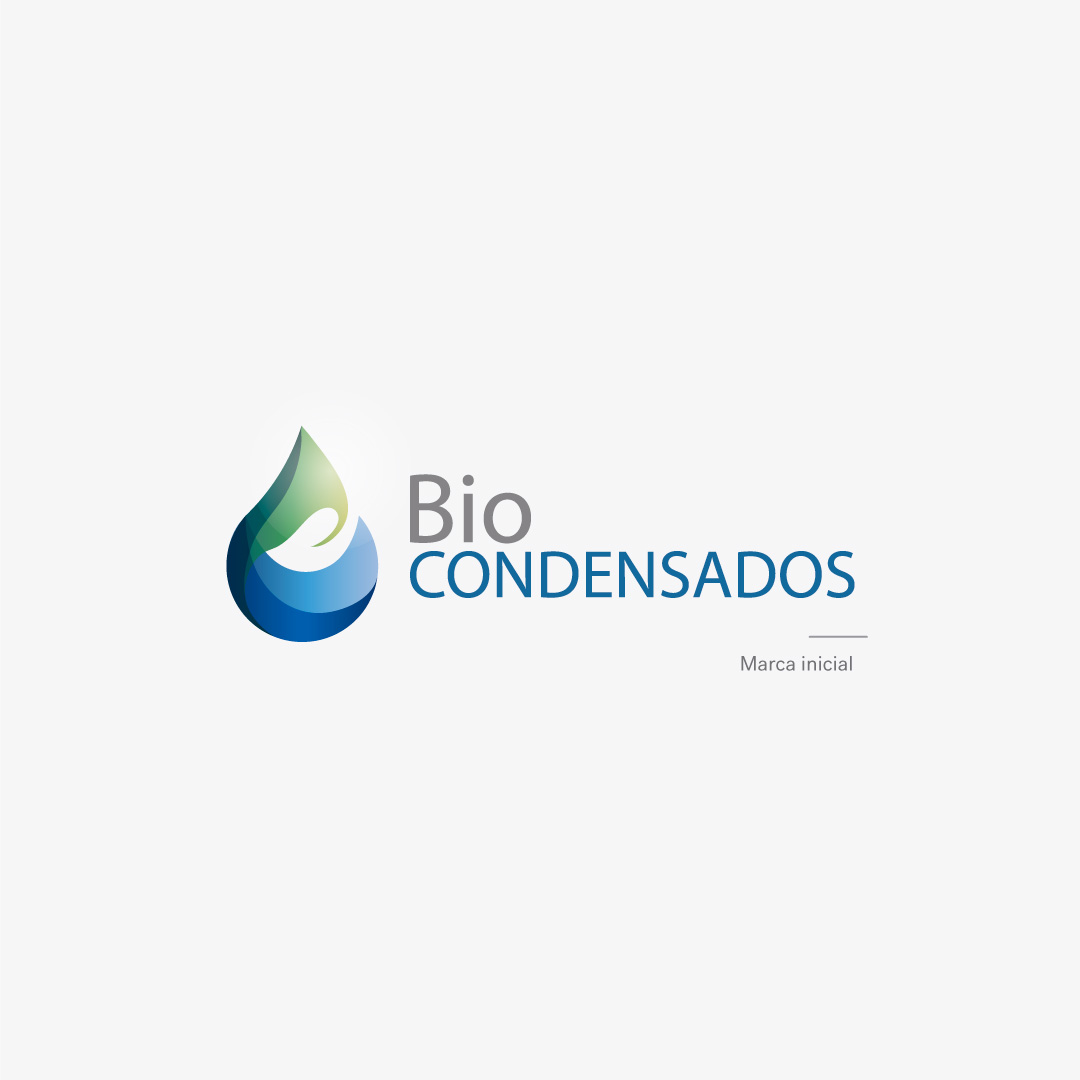
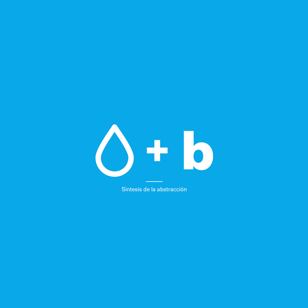
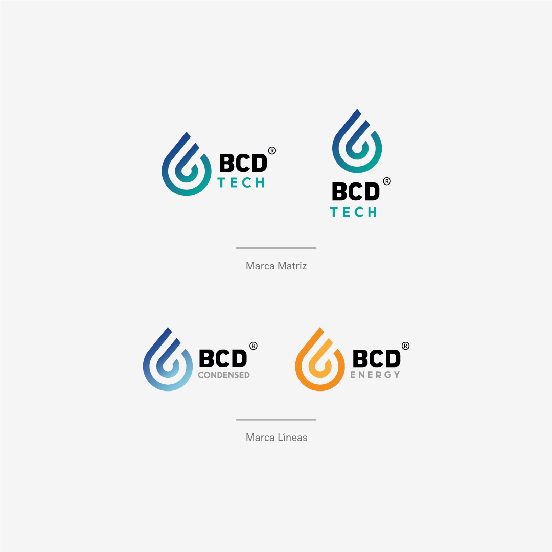
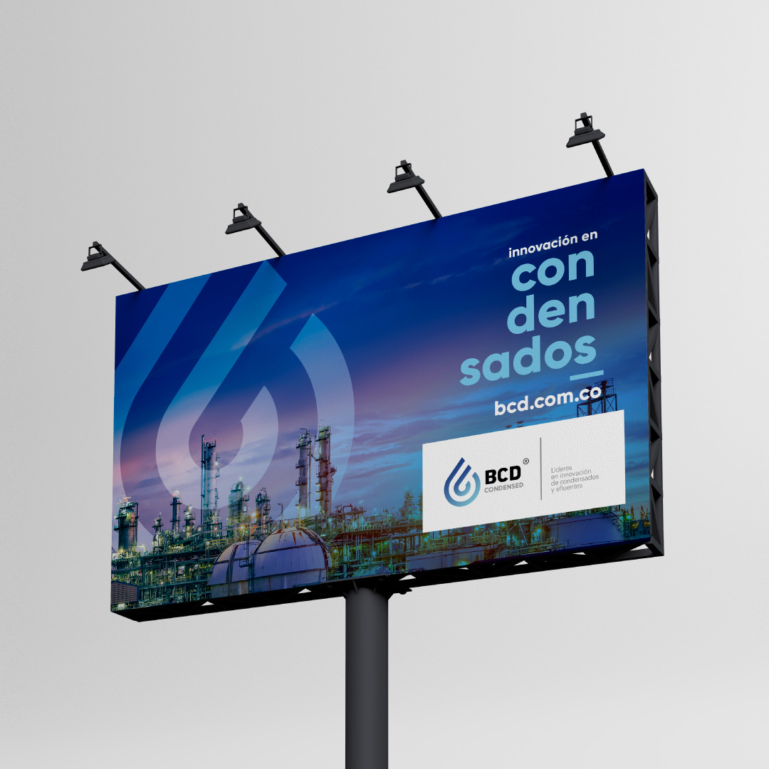
As part of the brand evolution process, it was decided to retain the water droplet as the core concept for the company’s image, as it truly encapsulates the company’s work and philosophy. The logo is simplified by reducing it to just two strokes, which implicitly include the letter “b” from the previous name, Biocondensados, in the inner stroke, and less explicitly the letter “c” in the outer stroke.
We underwent a name reduction with the aim of facilitating internationalization, creating a name or acronym that is easy to pronounce in any language. Thus, we successfully synthesized it into the name “BCD Tech,” encapsulating the essence of design and creation of technologies for industrial use. This name encompasses two business lines: “Water and Condensates” and “Boiler Efficiency.”



The BCD brand was crafted by designing its logo with a golden ratio grid. In other words, all its strokes, curves, and geometry adhere to measurements specifically derived from this grid, serving as a reference to ensure that all elements are harmonious. This approach establishes a higher degree of visual identity, as the isotipo unknowingly reflects a constructional harmony that makes it easier to remember and solidify in the minds of our target audience.
